DVLP Studio · Design system
Lab Paper
DVLP is a pharmaceutical drug-development platform, which means its screens are mostly tables, statuses, and citations. I built the system that keeps all of that calm: a warm bone-paper canvas, exactly one accent, a single grotesk, and a type scale sized around the data rather than the marketing page. Twenty-six boards, light and dark, from color tokens down to the sign-in screen.
- Role
- Design engineer
- Years
- 2025–26
- Stack
- Figma · Tailwind · Storybook
- Scope
- 26 boards, 2 themes
02
Foundations
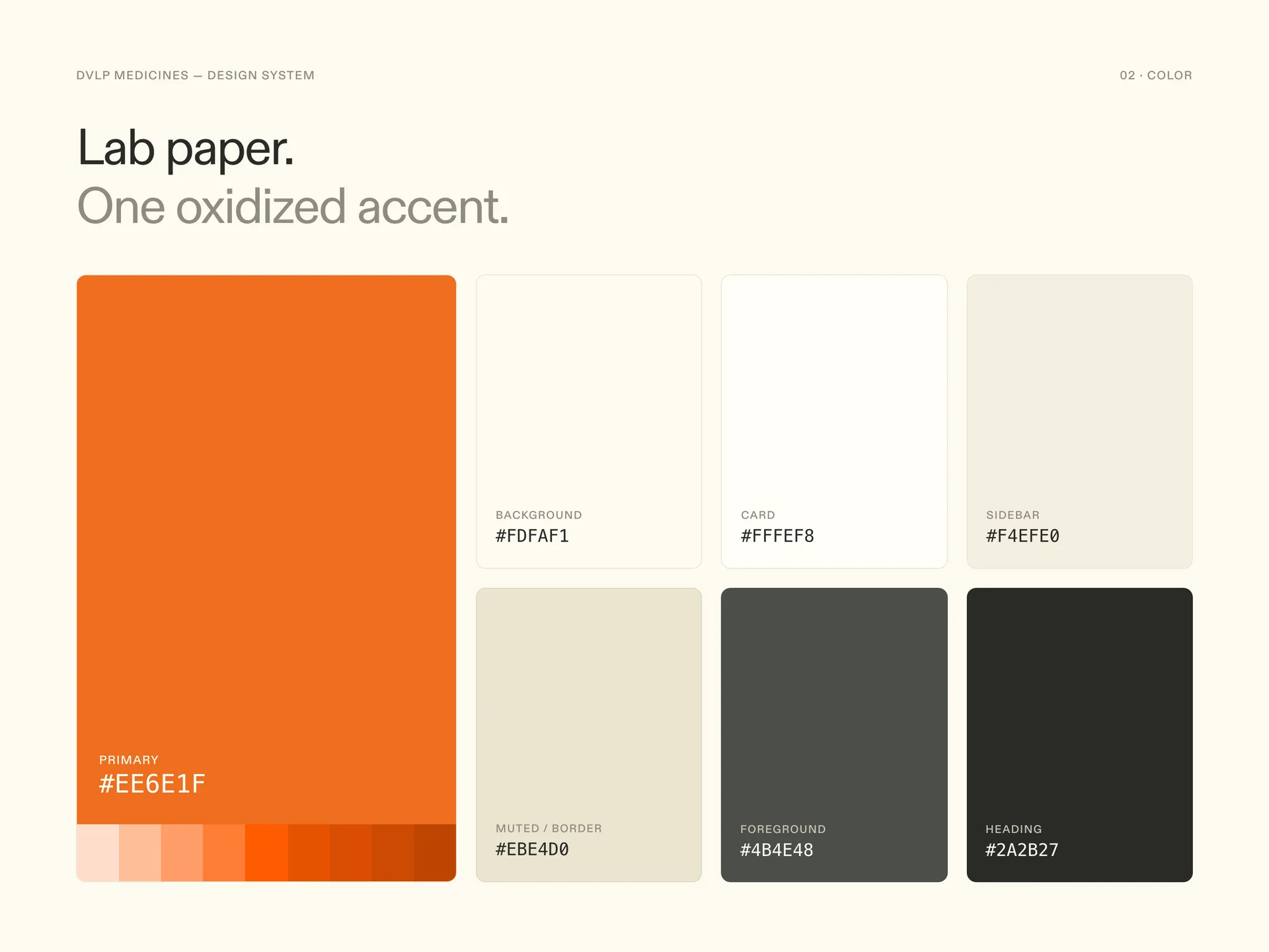
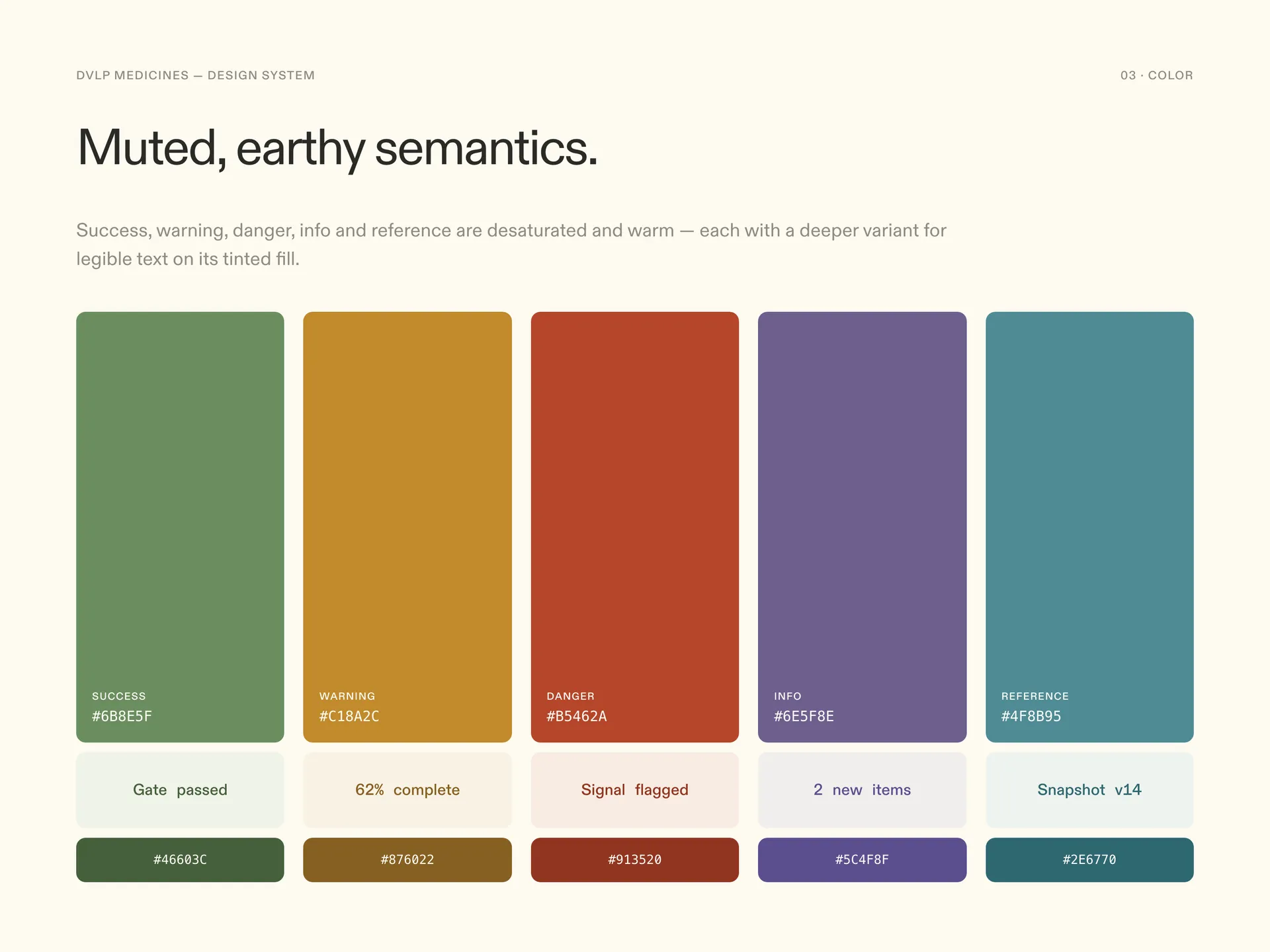
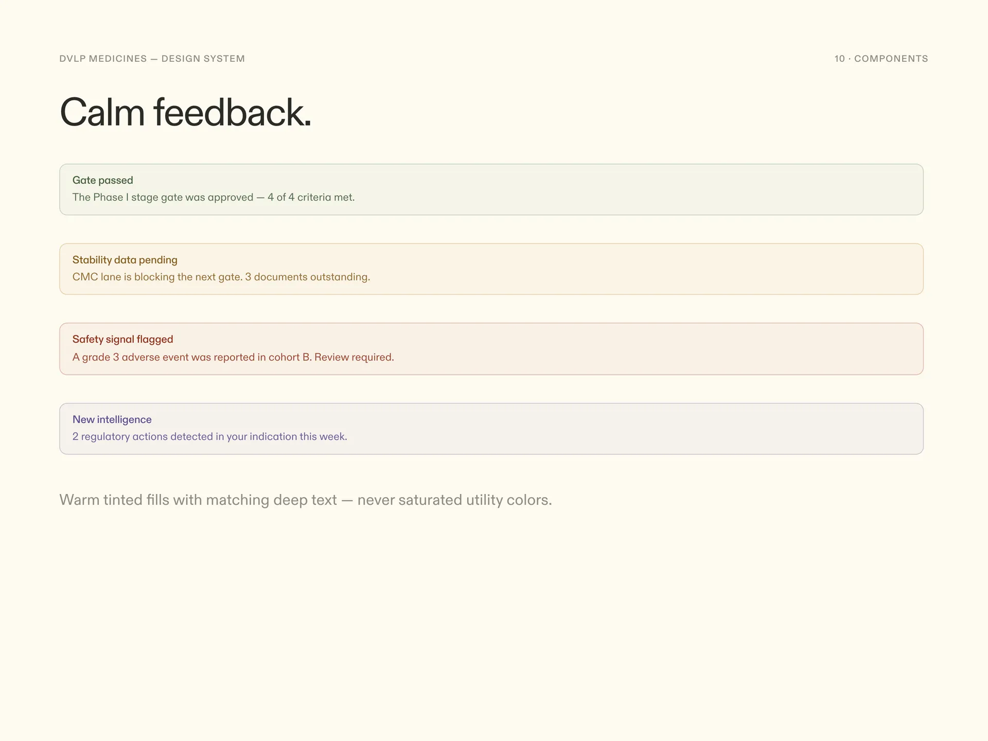
The canvas is a warm bone paper rather than white, so a day of staring at tables feels closer to reading a printed protocol than a spreadsheet. On top of it sits one accent, an oxidized orange, reserved for the primary action and the current selection. Everything else that needs color gets it from a small semantic set for states and domains, kept muted so a page full of statuses never turns into a fruit salad.
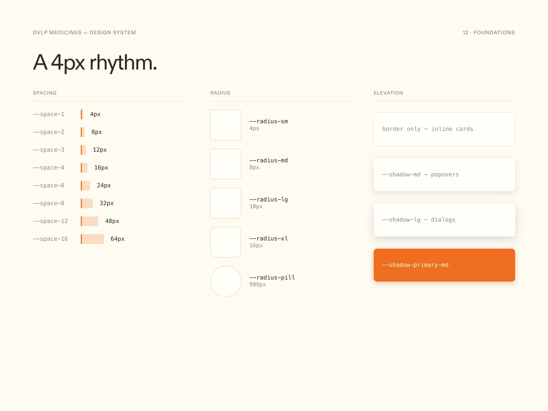
Underneath, the boring tokens do the real work: a 4px spacing grid, three radii, and shadows soft enough to read as paper lifting off paper instead of cards floating in space.
03
Type that carries data
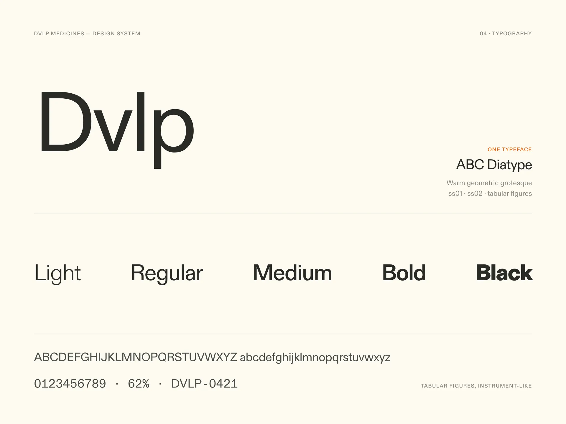
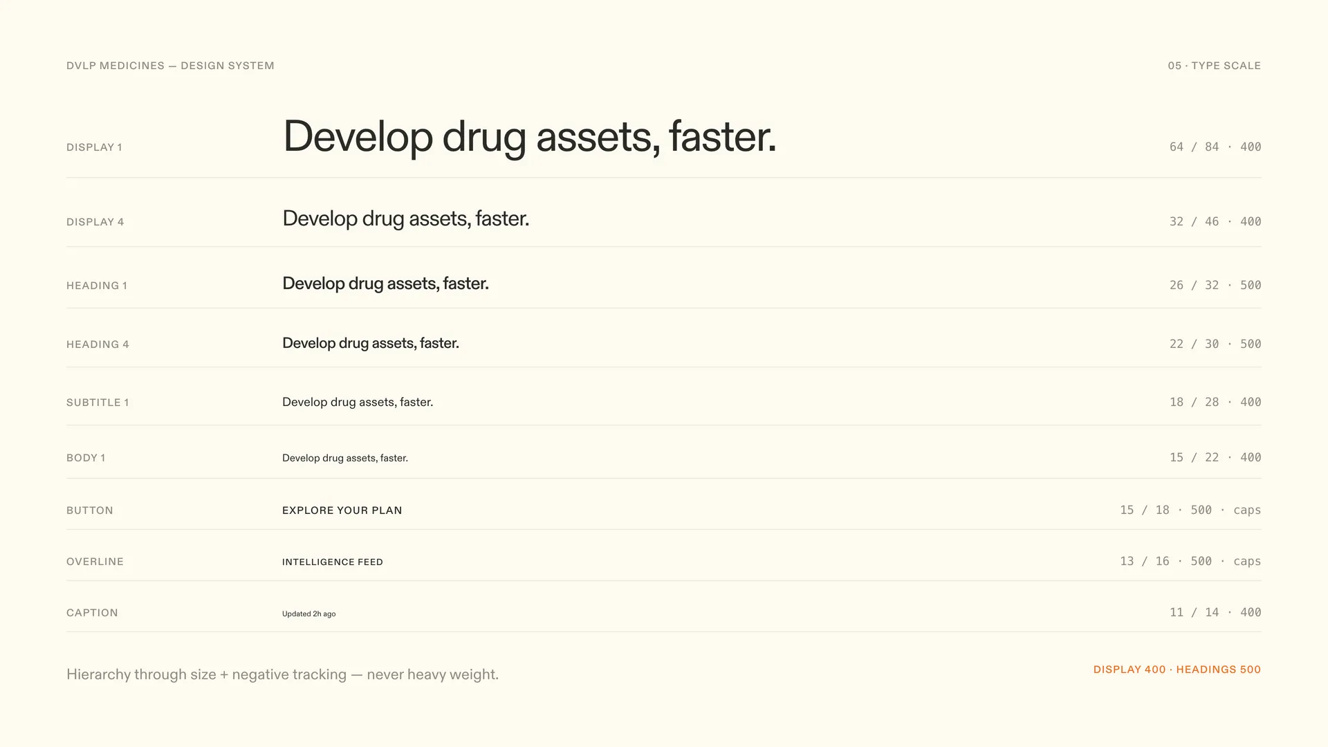
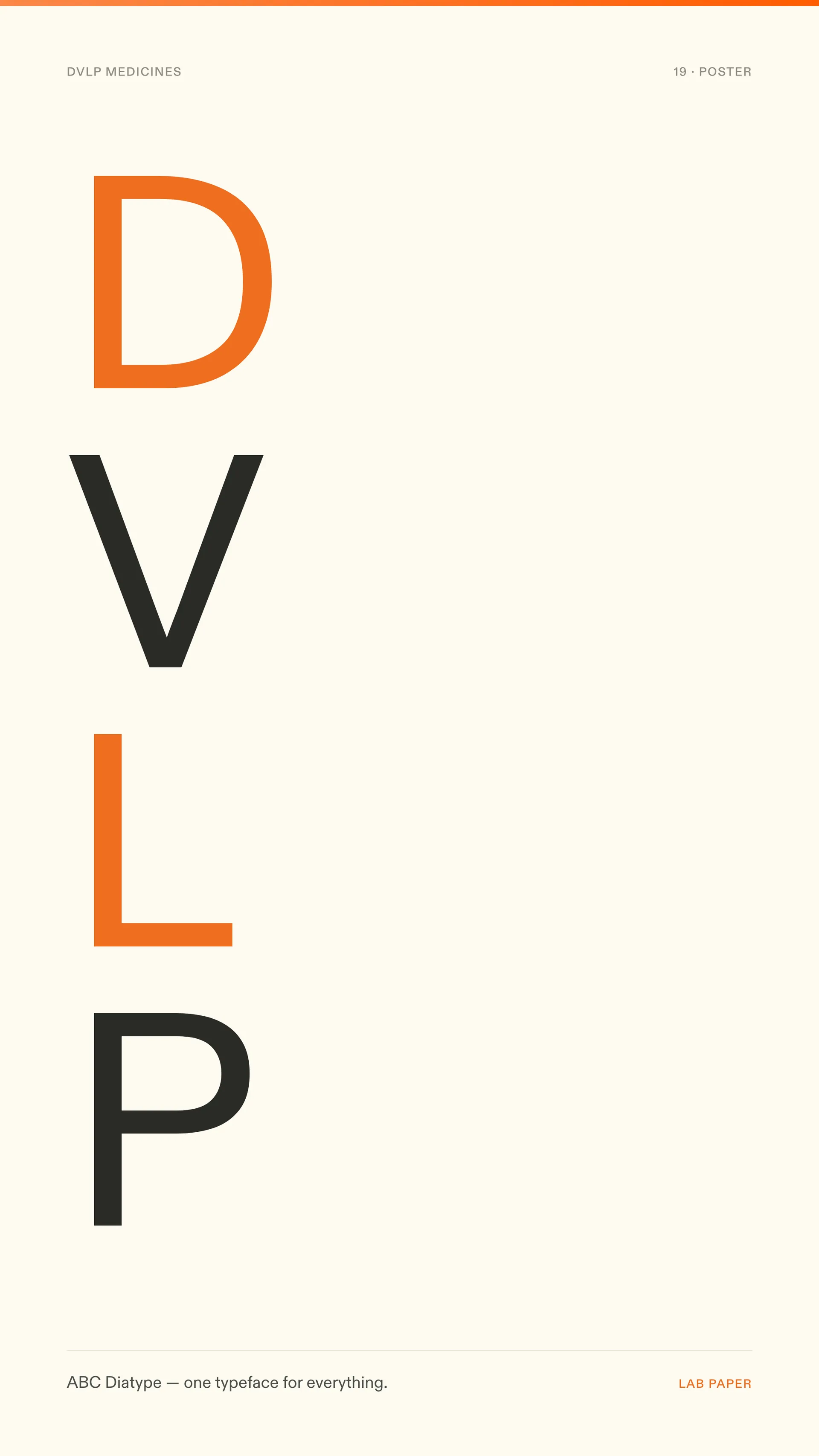
One typeface does all the talking: ABC Diatype, in the product at every size. A drug program page can hold a heading, a dense table, a citation, and a timestamp within one viewport, so the scale was tuned from the small end up. The 12 and 13px steps had to survive a forty-row table before anything else was decided, and tabular figures are on by default anywhere a number can appear.
The steps are fewer than most scales I have shipped. When every size earns its place, a screen with six data densities still reads as one voice.
04
Components
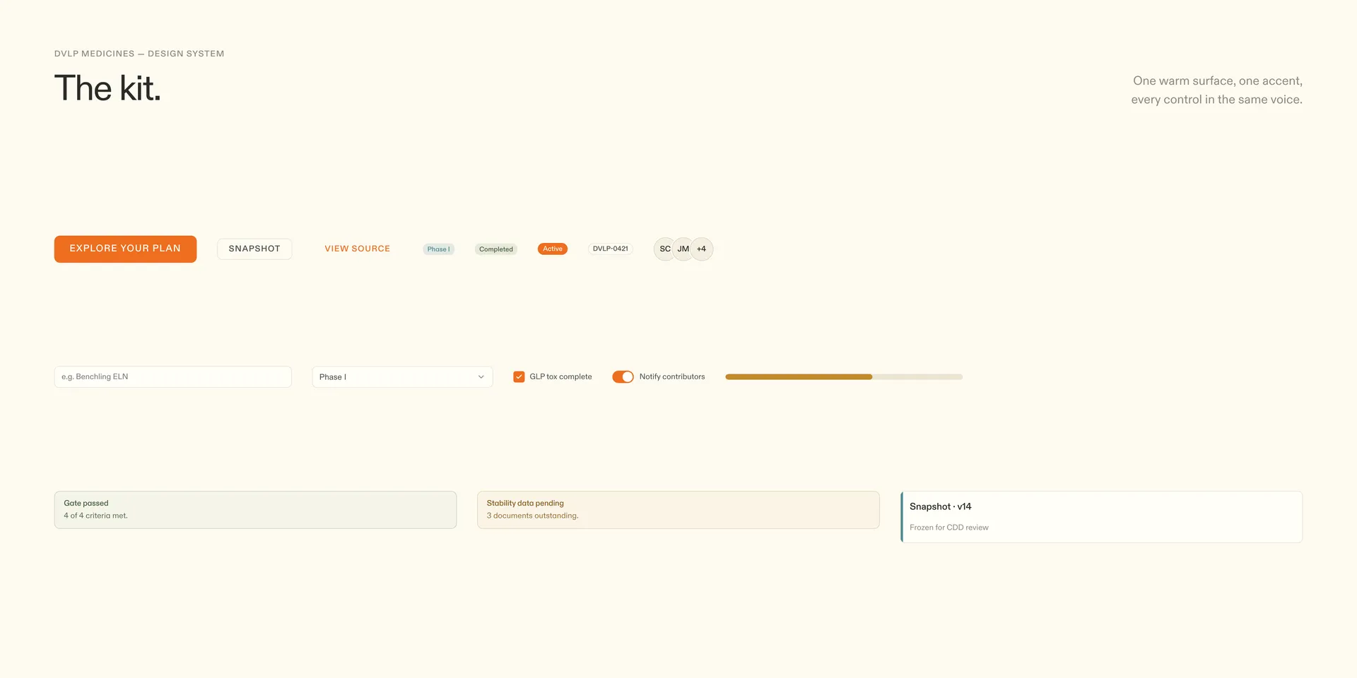
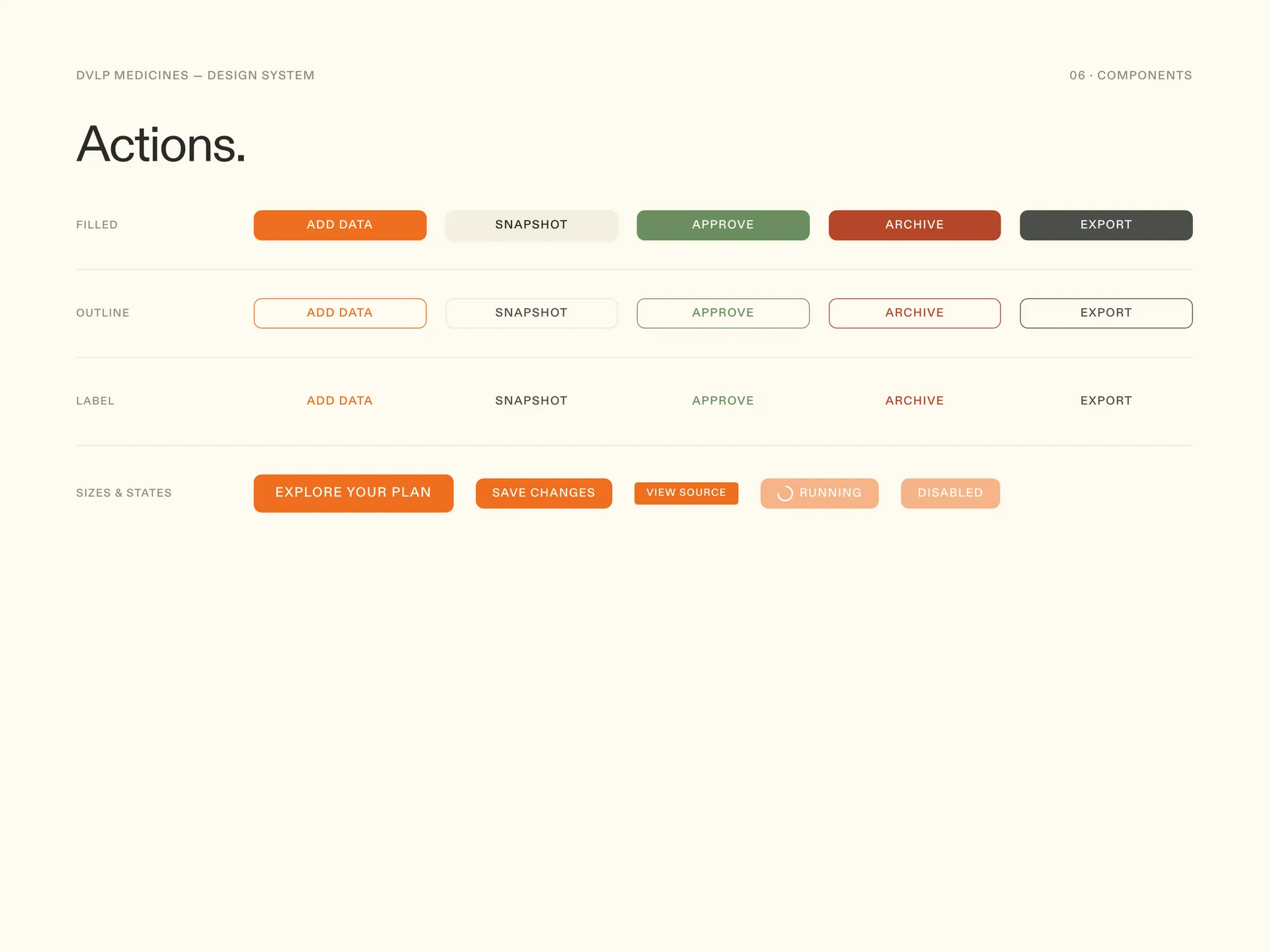
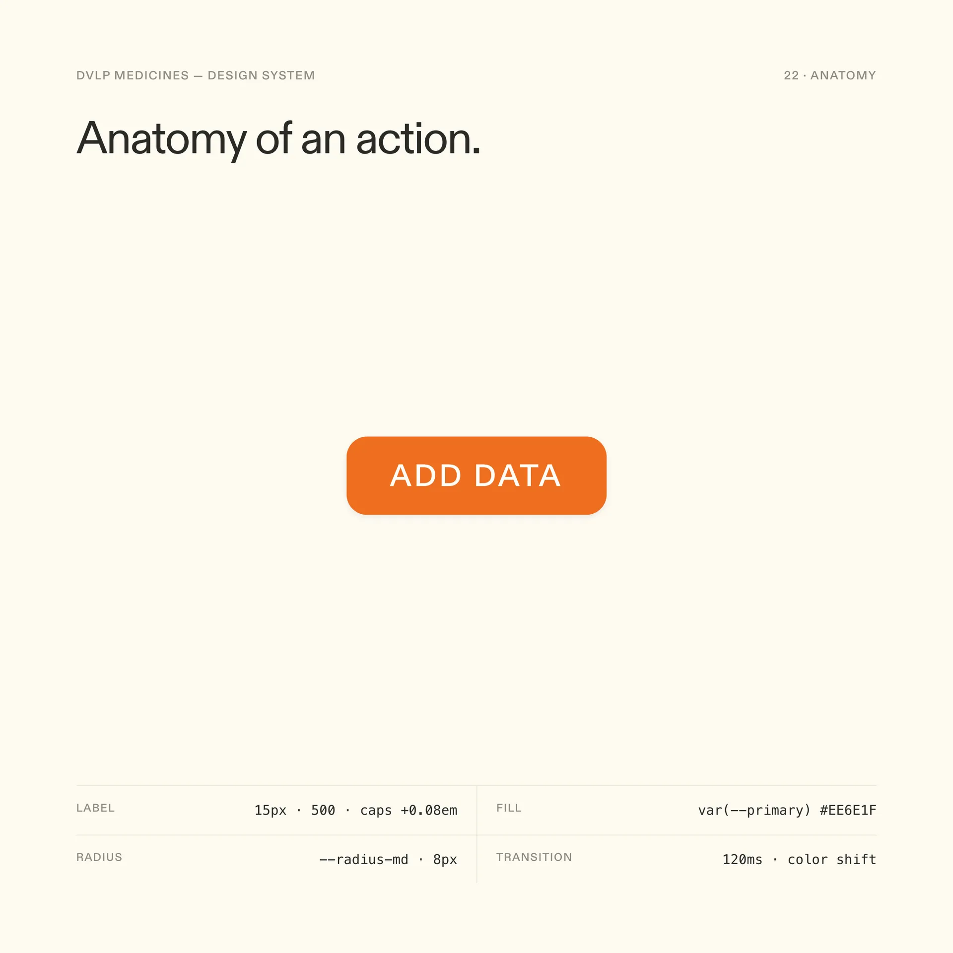
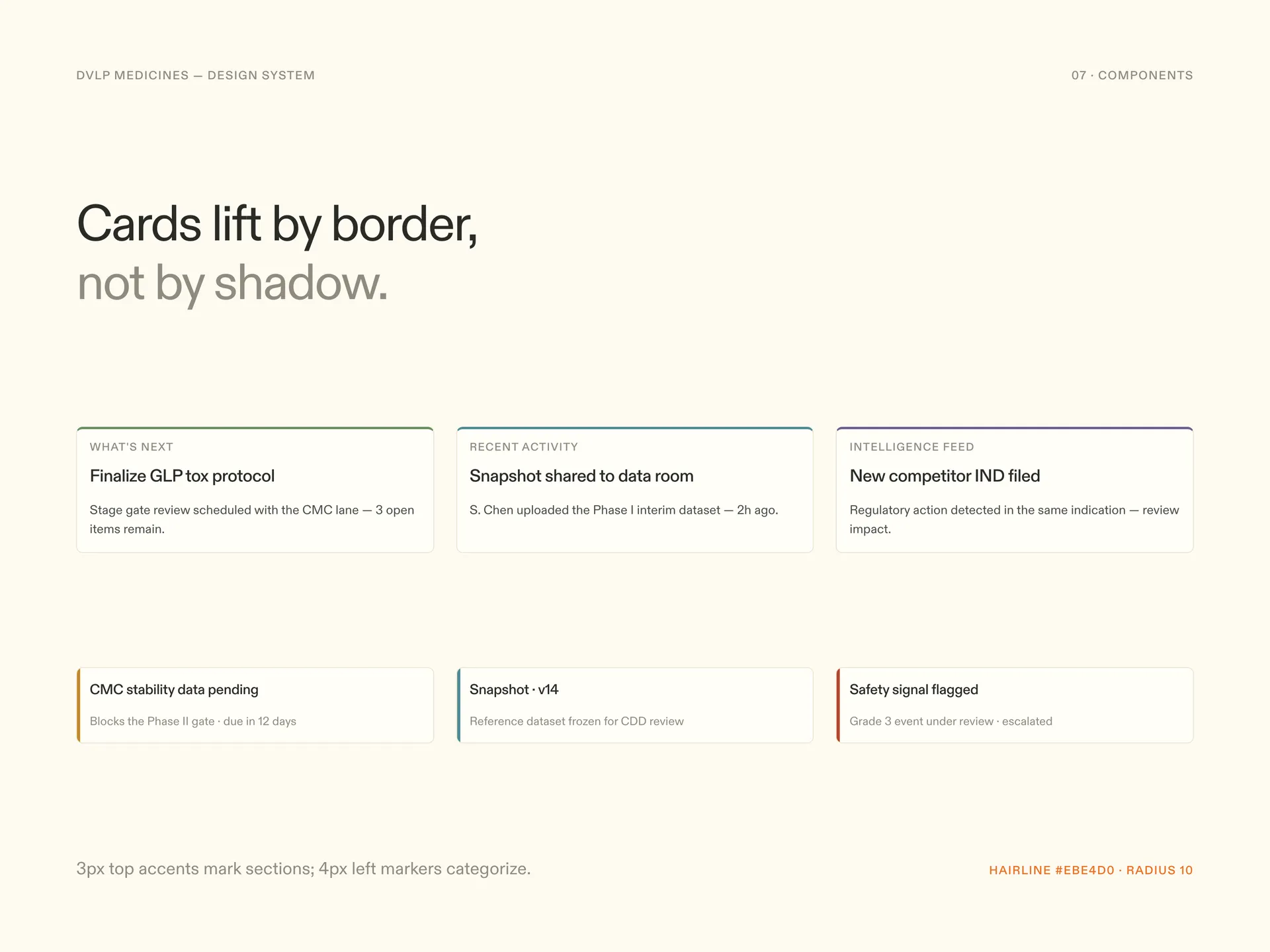
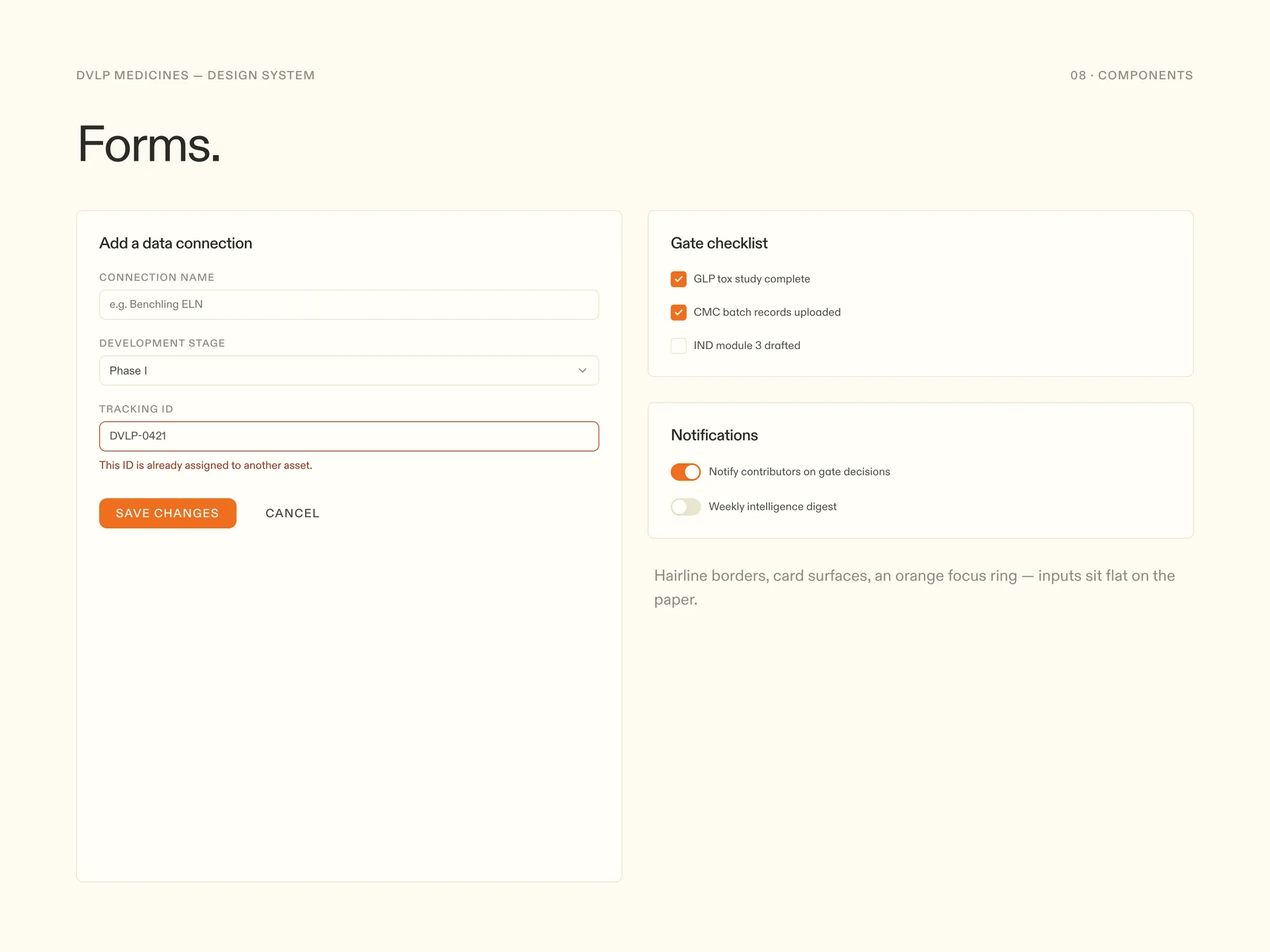
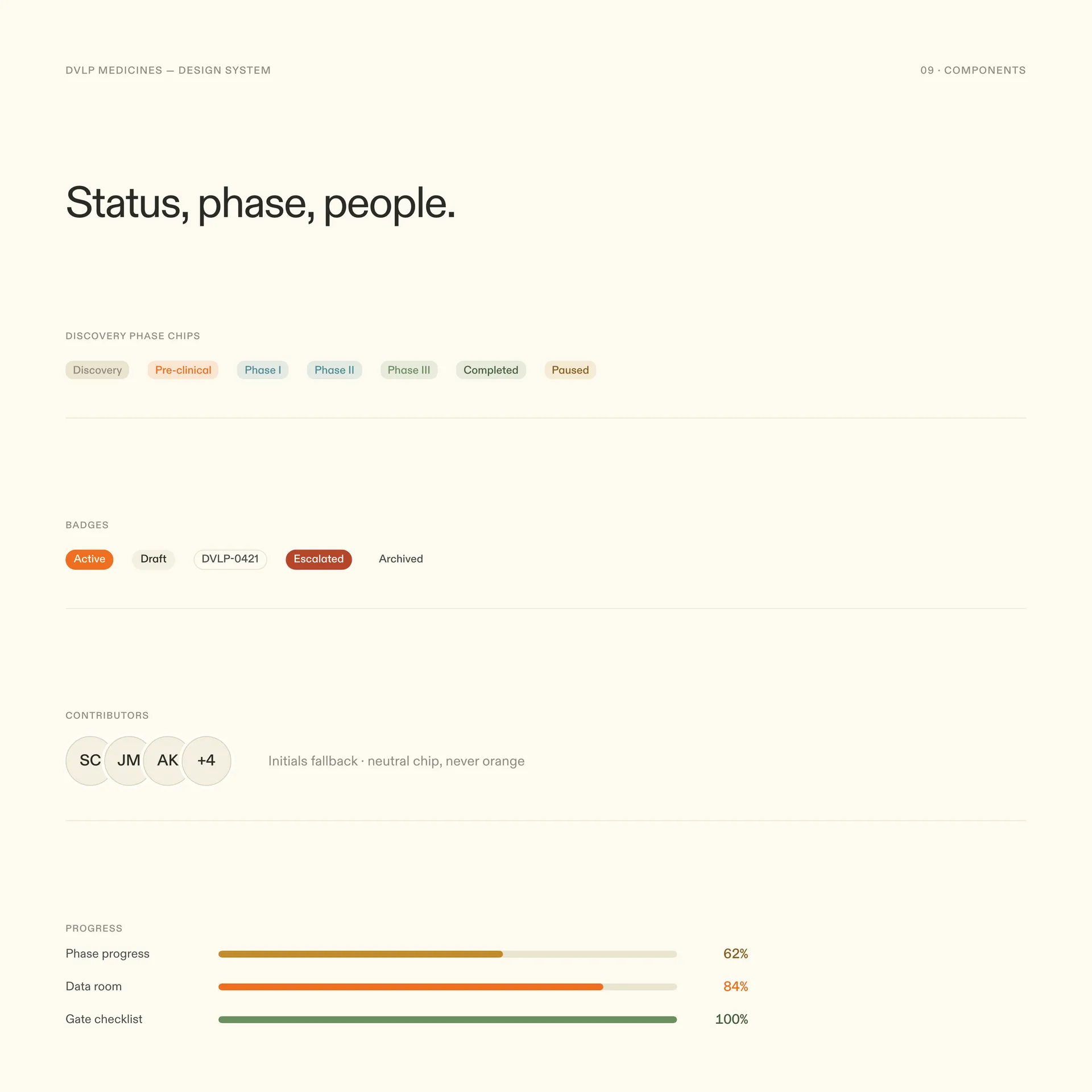
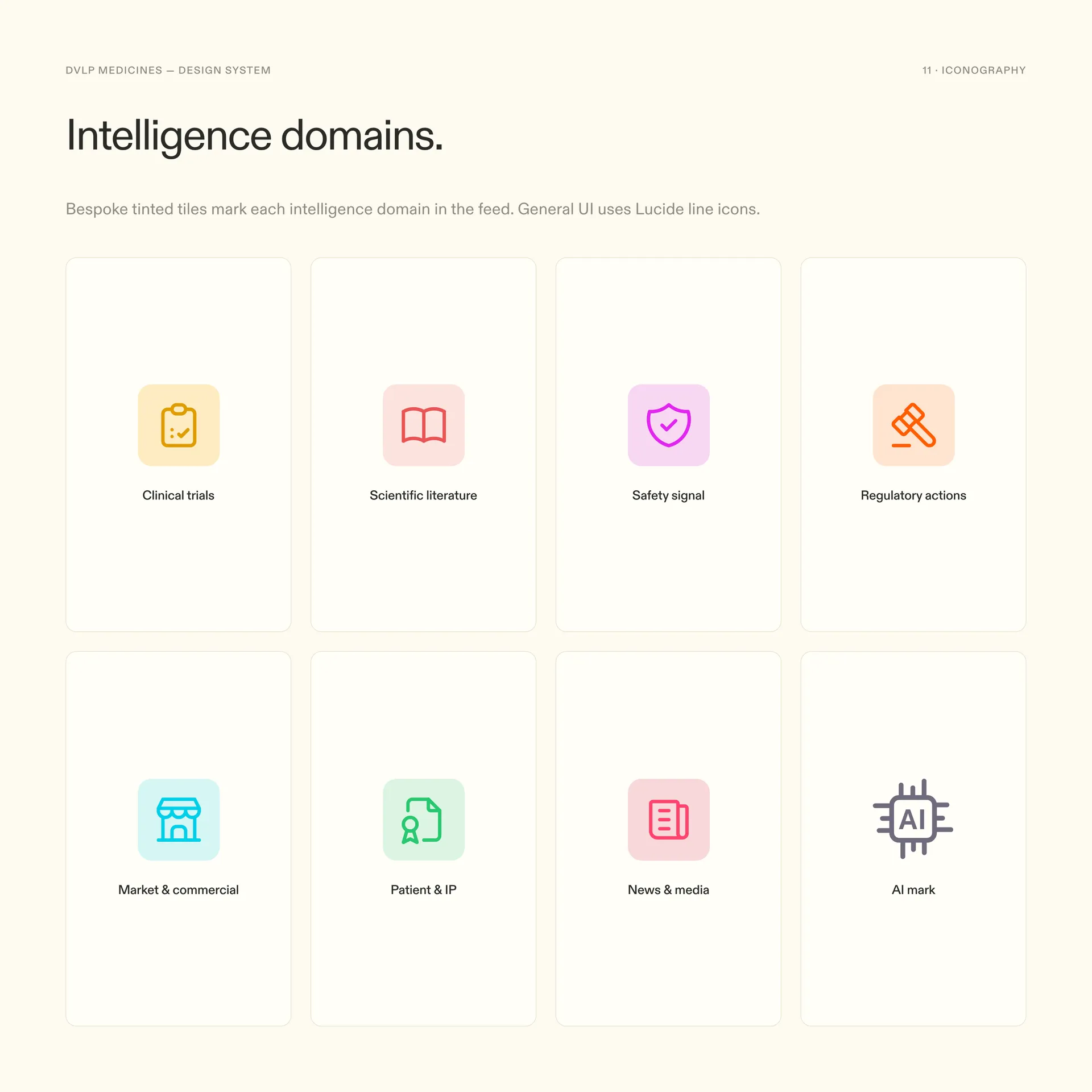
The component set is deliberately small and deliberately documented. Buttons, cards, forms, badges, feedback, and a family of domain icons cover almost every screen in the platform, and each one exists in Storybook with the same names it has in Figma. I wrote anatomy notes for the pieces engineers touch most, so a button is a spec you can build from, not a picture you have to interpret.
05
Applied
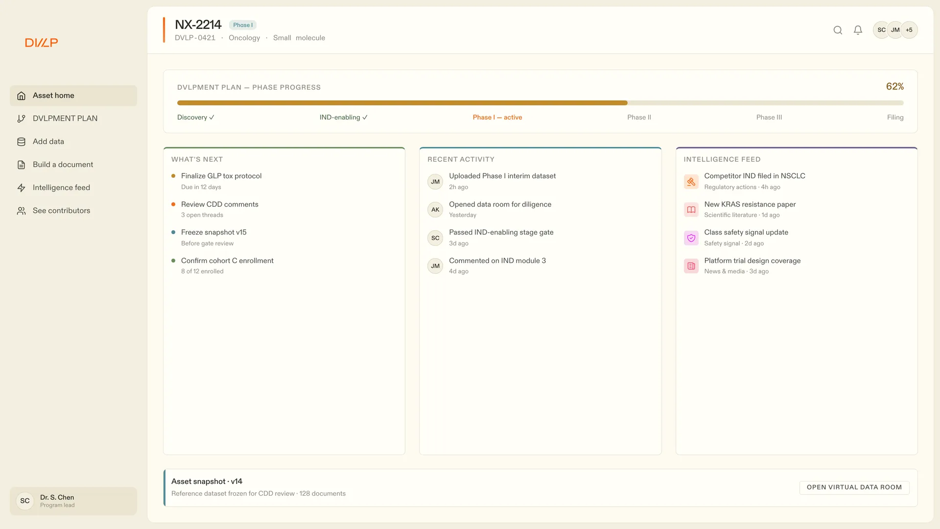
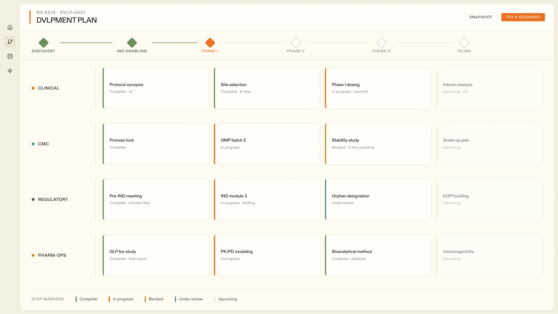
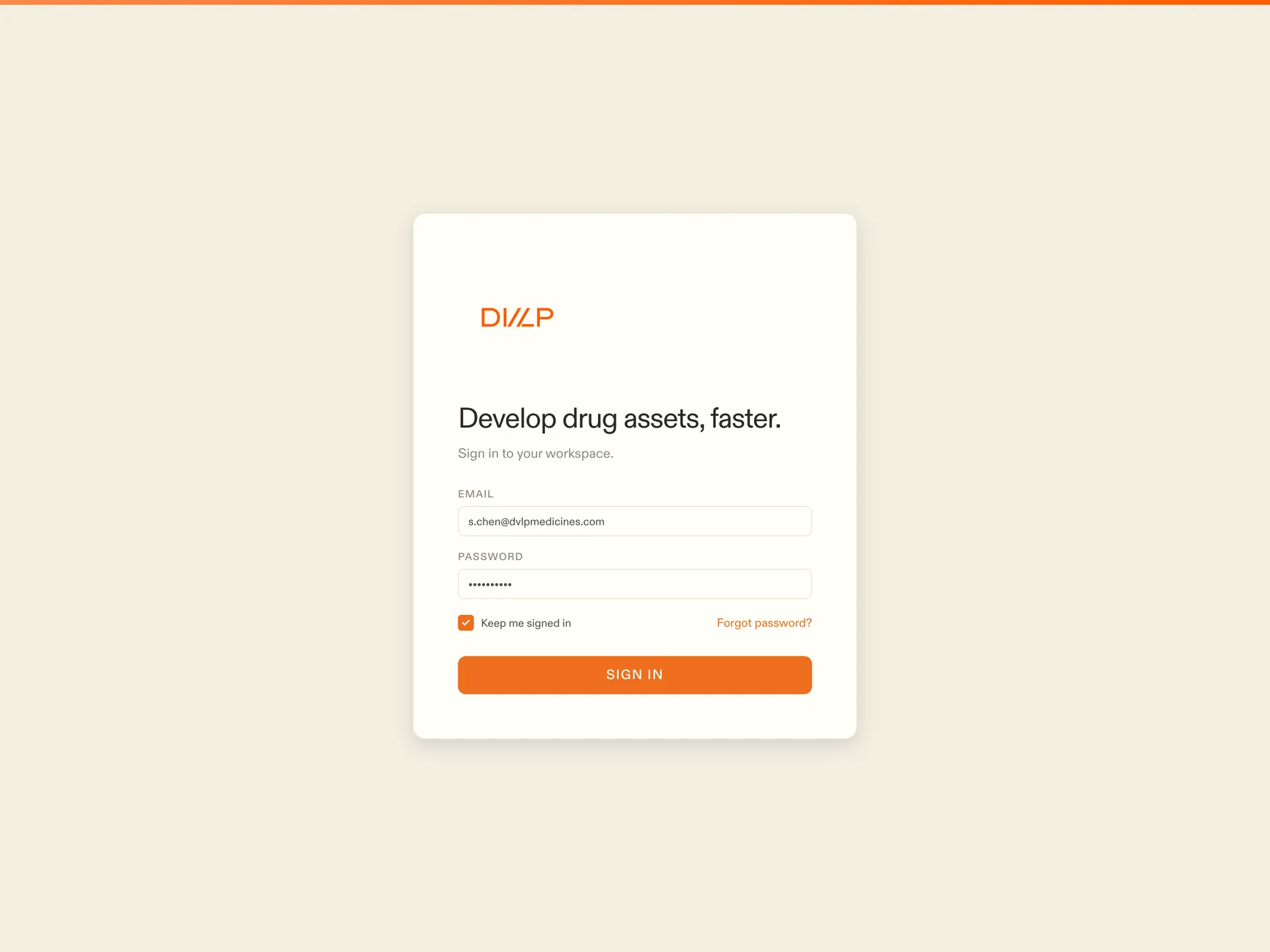
A system is only proven on a real screen, so the boards end where the product begins. The asset home and the development plan are the two densest surfaces in DVLP, and both are assembled entirely from the components above. Nothing custom, nothing off-grid. The sign-in screen is the small test I hold every system to: with only two fields and a button, it should still be unmistakably this product.
06
Dark mode
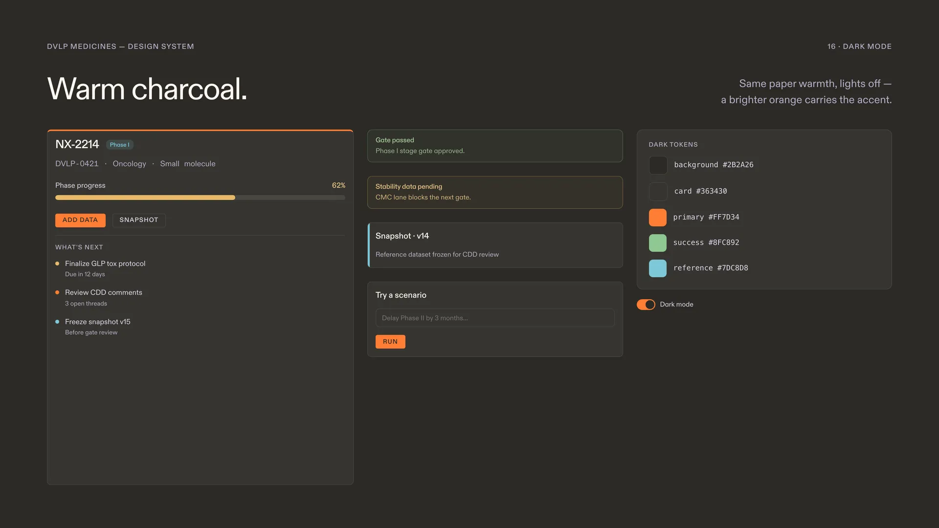
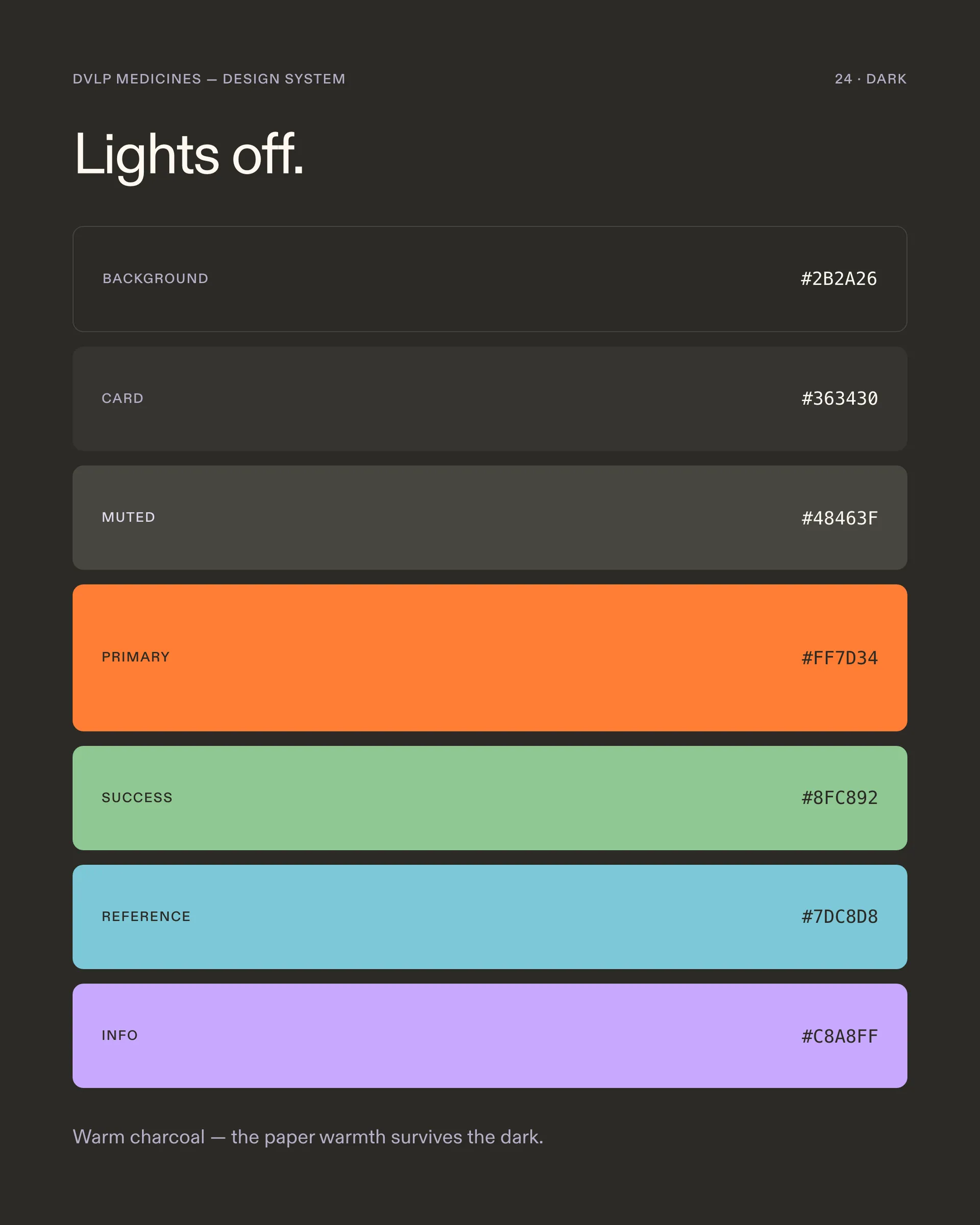
Dark mode is not the palette inverted. Paper becomes a warm near-black, ink becomes bone, and the oxidized orange stays put, re-checked for contrast against the new ground. The semantic accents were re-mixed by hand, because status colors that pass on paper can vanish or scream on dark. Both themes ship from the same tokens, so a component never knows which one it is in.